Lunch On Us
Lunch On Us demonstrates how thoughtful design can turn a social initiative into a movement built on dignity, care, and community. The brand reframes student support—transforming a free meal into an empowering, stigma-free experience that celebrates accessibility and belonging.
By blending bold, utilitarian design with warm, humanising details, the identity speaks to two audiences at once: students seeking approachable, judgment-free support, and sponsors wanting meaningful ways to connect with young people. The result is a brand that feels trustworthy and uplifting—not charity, but community in action.
-
Lunch On Us is a student-focused initiative providing free, accessible meals on campus through vending machines. The goal was to create a brand that embodied dignity, inclusivity, and practicality—ensuring no student feels shame in seeking support.
Funded through integrated sponsor advertising on packaging and vending machines, Lunch On Us needed to appeal to both students and sponsors, establishing itself as a sustainable, scalable solution to food insecurity on campus.
-
Food insecurity among Australian university students is high and worsening, with over half experiencing some level of it in 2024. Lunch On Us responds to this by making access to food effortless and stigma-free, turning support into a shared, everyday experience.
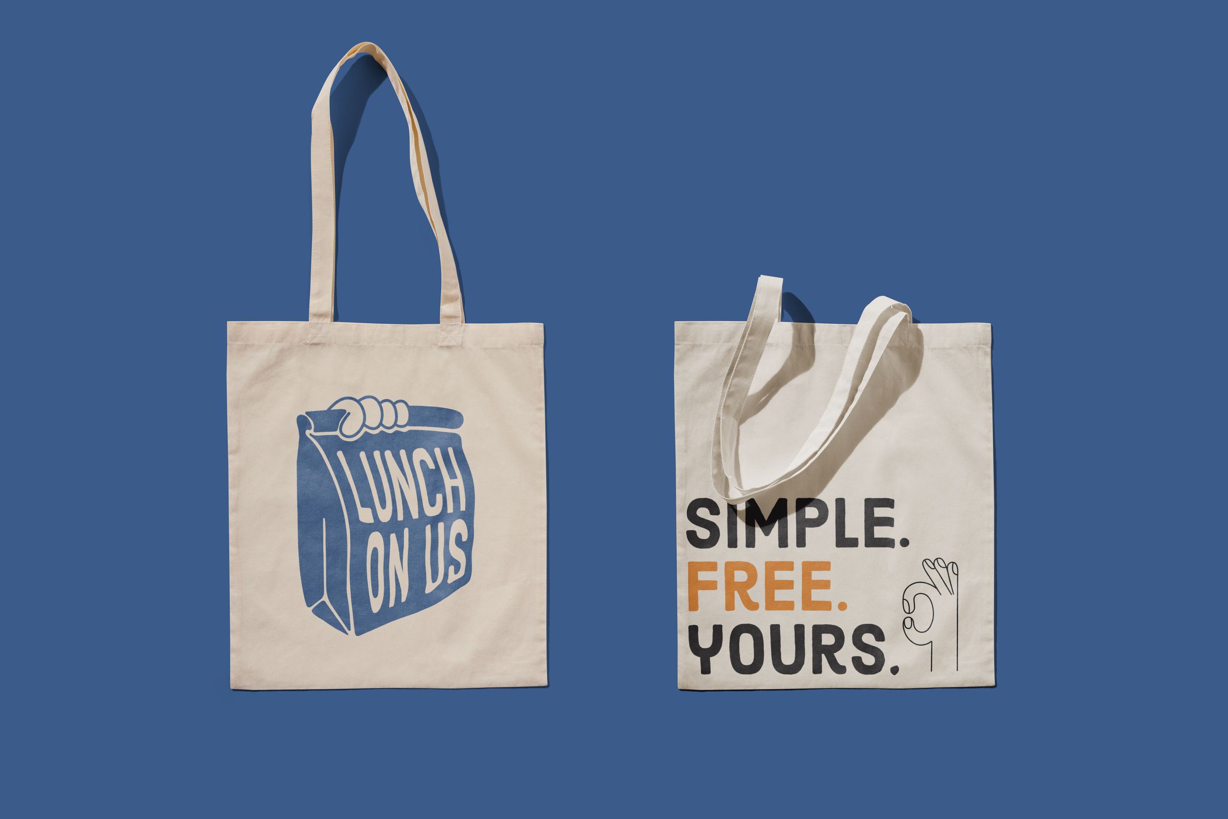
The visual identity draws on two archetypes—the Everyman and the Caregiver—to balance practicality with empathy. Clean typography, muted colours, and friendly iconography communicate warmth and inclusivity while maintaining a grounded, utilitarian feel.
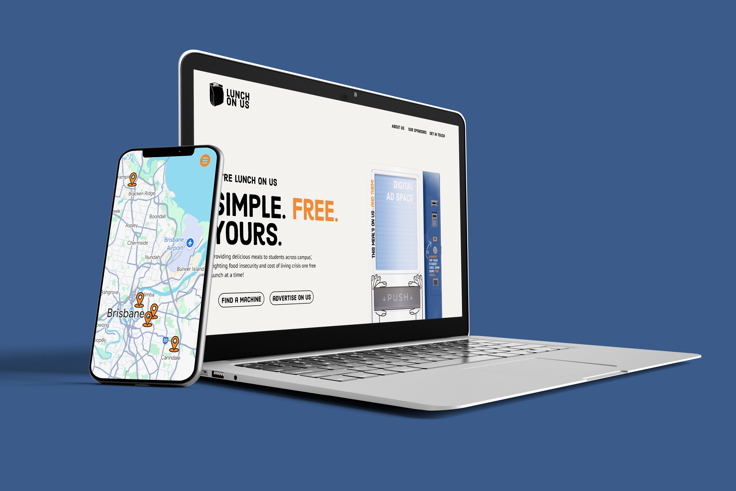
A full brand guide, website UI layout design, and marketing case studies were developed to extend the system across digital and physical touchpoints. Together, they position Lunch On Us as a scalable model for compassionate design—less about charity, more about community care.
-
Brand identity and logo system
Colour palette & typography
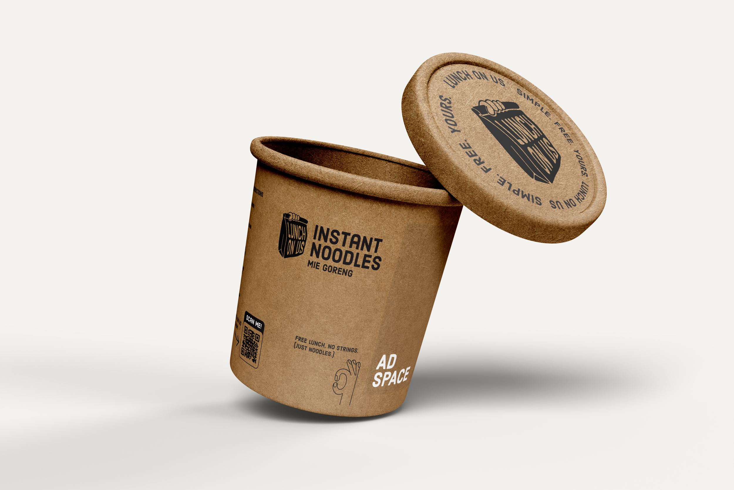
Packaging design
Vending machine graphics
Full brand guide
Website UI layout design
Marketing case studies
Digital and print assets
Tone of voice guide and brand strategy
-
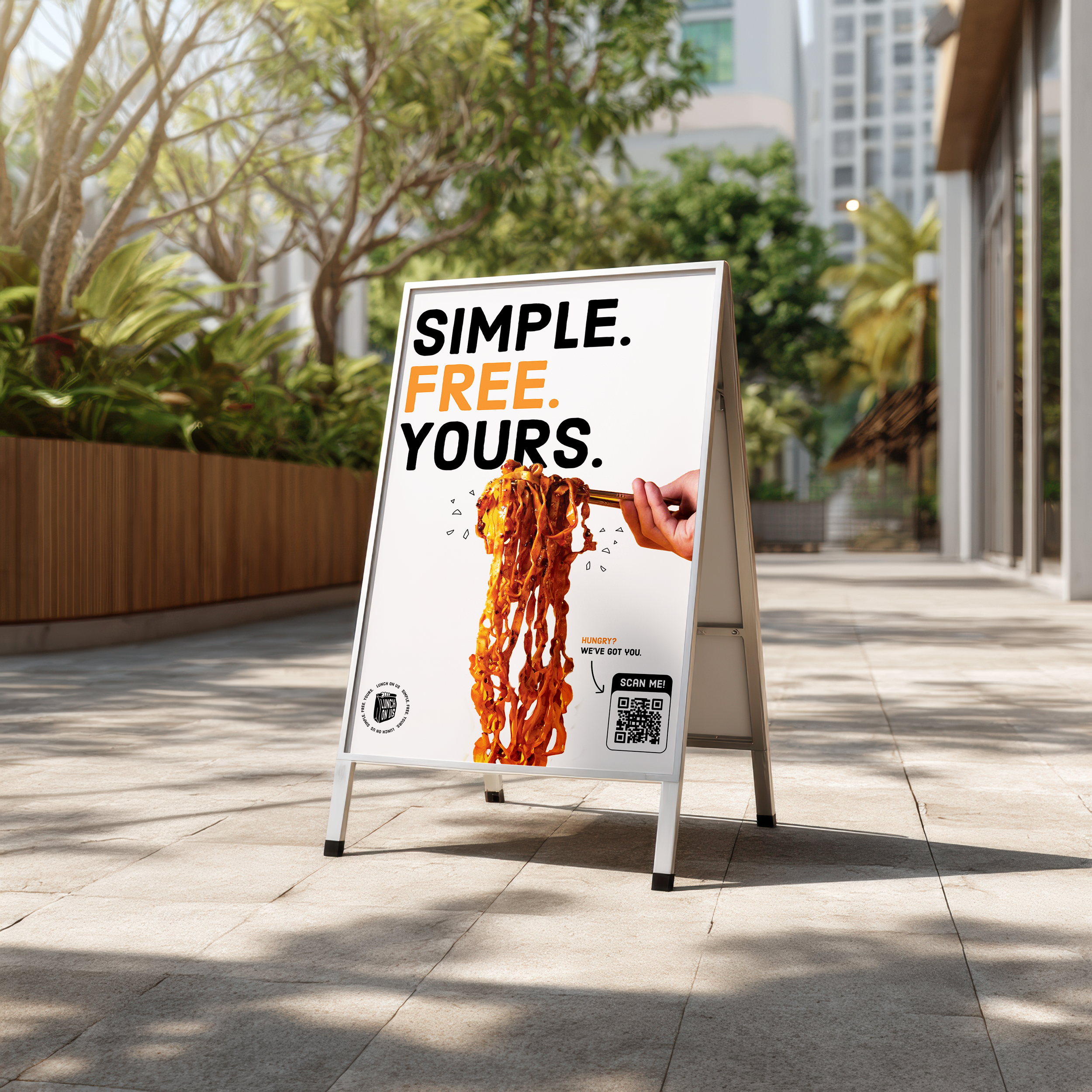
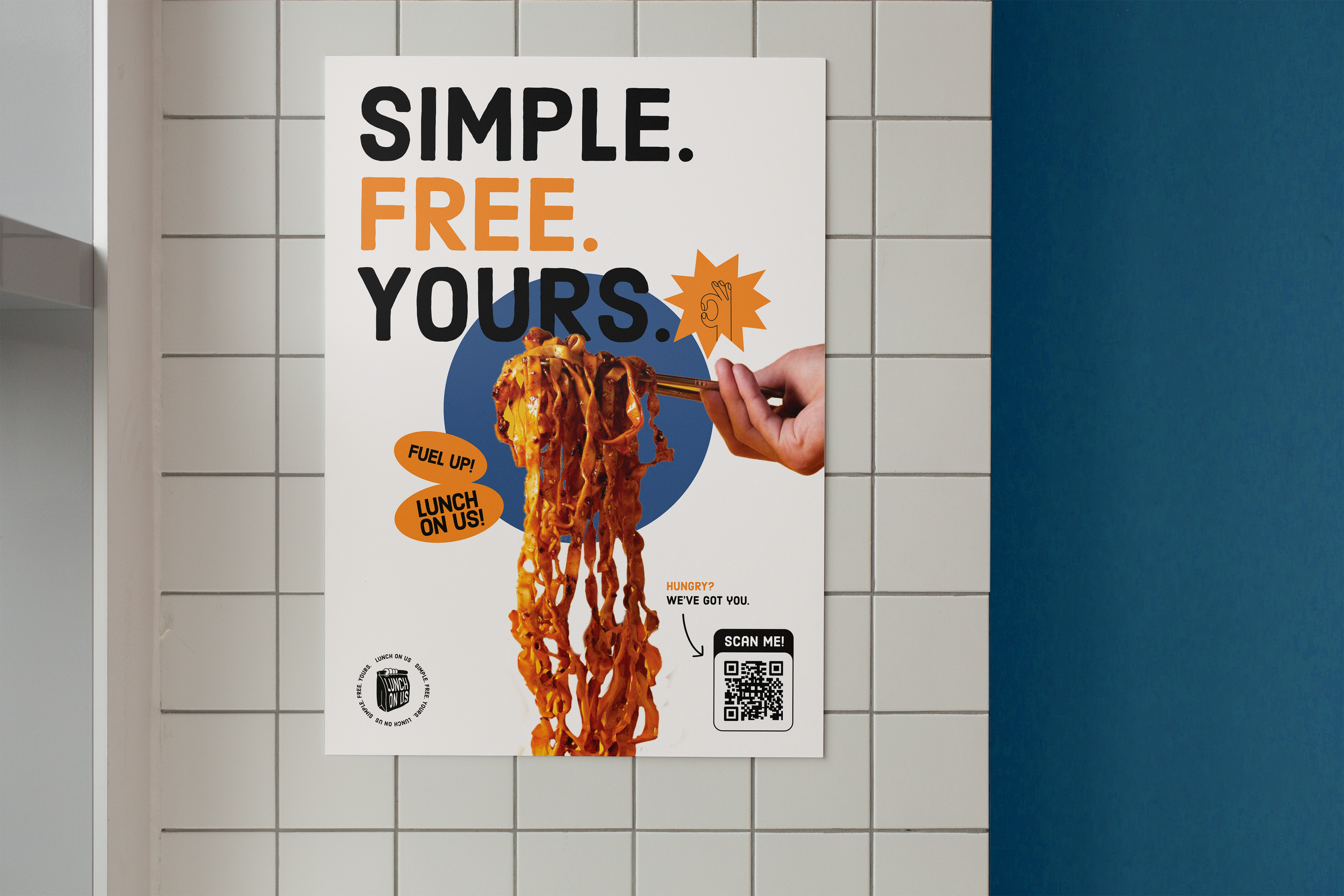
The visual identity for Lunch On Us was designed to feel friendly, approachable, and energetic while maintaining flexibility for sponsor integration. A vibrant palette of orange and deep blue communicates energy and accessibility, while black and muted white elements allow sponsor branding to coexist without visual conflict. Hand-drawn iconography and logo elements were chosen to feel relatable, youthful, and friendly, reinforcing the approachable nature of the service. The system balances vibrancy with clarity, creating a visual language that communicates positivity, inclusivity, and community support for students.
-
To ensure Lunch On Us genuinely resonated with students, user engagement and testing played a critical role in shaping the brand direction. The goal was to create an identity that felt authentic, trustworthy, and emotionally engaging — a brand students could see themselves in, rather than one that talked at them.
After extensive research and mood boarding, audience testing was conducted using several drafts of the core visual identity elements. Participants were asked to respond to each concept based on emotional connection, relatability, and perceived tone. Through this process, students identified strongly with branding that communicated friendliness, reliability, relatability, energy, and positivity.
Testing revealed that the paper bag logo was the most emotionally resonant. Many participants associated it with feelings of care, nostalgia, and comfort, recalling personal memories of home-packed lunches or school canteens. This emotional connection gave the brand a unique sense of warmth and authenticity. Meanwhile, the hand motif was praised for its friendly and approachable character, leading to its incorporation throughout the visual identity and into the final logo design — a hand holding a paper bag.
“The paper bag made me think of when my mum used to pack my lunch in high school — it just feels really comforting.”
“The hand illustration feels really friendly. It’s like someone’s actually giving you something, not just a logo sitting there.”
“I like that it feels youthful and positive, but not childish. It looks like something made for us, not for a charity.”
Colour testing also played an important role in shaping the emotional tone of the brand. The final palette balanced playfulness and energy with warmth and care — ensuring Lunch On Us came across as approachable and empowering, not patronising. Students described the palette as “fresh,” “uplifting,” and “something I’d actually stop and look at on campus.”
Equally important was feedback around tone of voice. Students expressed that they wanted the messaging to feel empowering and relatable, avoiding any sense of stigma or pity often associated with free meal programs.
“It’s such a good idea, but I wouldn’t want to feel like I’m taking charity. The branding makes it feel more like a community thing, which I love.”
This user engagement directly shaped the creative decisions for the final brand identity and communication style. By grounding the visuals and language in empathy, familiarity, and positivity, Lunch On Us successfully positioned itself as a supportive initiative that students could genuinely connect with and feel proud to be part of.
“It feels like something made by students, for students — not a corporate thing pretending to get us.”
— Griffith University Student

Student Feedback
“The colours make it feel fun and fresh. It actually catches your eye without feeling over the top.”
— QUT student
“It feels really trustworthy. Like I could see this around campus and know it’s something that’s safe and legit.”
— Griffith University student
“It looks modern and student-y in a good way. Not childish or charity-like.”
— Griffith University student