Meg On Mars
Meg On Mars demonstrates how strategic branding and design can amplify an artist’s voice and translate creative intent into a tangible experience. Every element was chosen to embody Meg’s romantic, mythic, and subtly gothic aesthetic. The identity was designed not just to look cohesive, but to communicate her storytelling, evoke emotional engagement, and create a consistent, recognisable presence across digital and physical touch-points. This project highlights how thoughtful branding can transform a distinct artistic style into a compelling, relatable, and professional brand experience that resonates with both current and new audiences.
-
Meg on Mars Ink is the personal brand of a fine-line tattoo artist whose work blends femininity, fantasy, and gothic romanticism. The goal was to create a cohesive visual identity that captured the emotional storytelling in her tattoos, while also improving clarity, consistency, and visibility across her platforms.
-
Although Meg’s tattooing style was distinct, her brand presence felt disconnected. She had limited consistency across platforms and no clear brand strategy, relying mostly on word-of-mouth and scattered social posts.
Through research, I drew on symbolic motifs — swords, planets, roses, mirrors — alongside medieval romanticism and witchy femininity to shape a brand world that feels dreamy, poetic, and just a little dangerous.
The resulting visual identity uses a star-and-planet logo, dramatic typography, and a monochrome palette to balance delicacy with strength. Supporting icons and textures expand the system across print, digital, and merch applications.
-
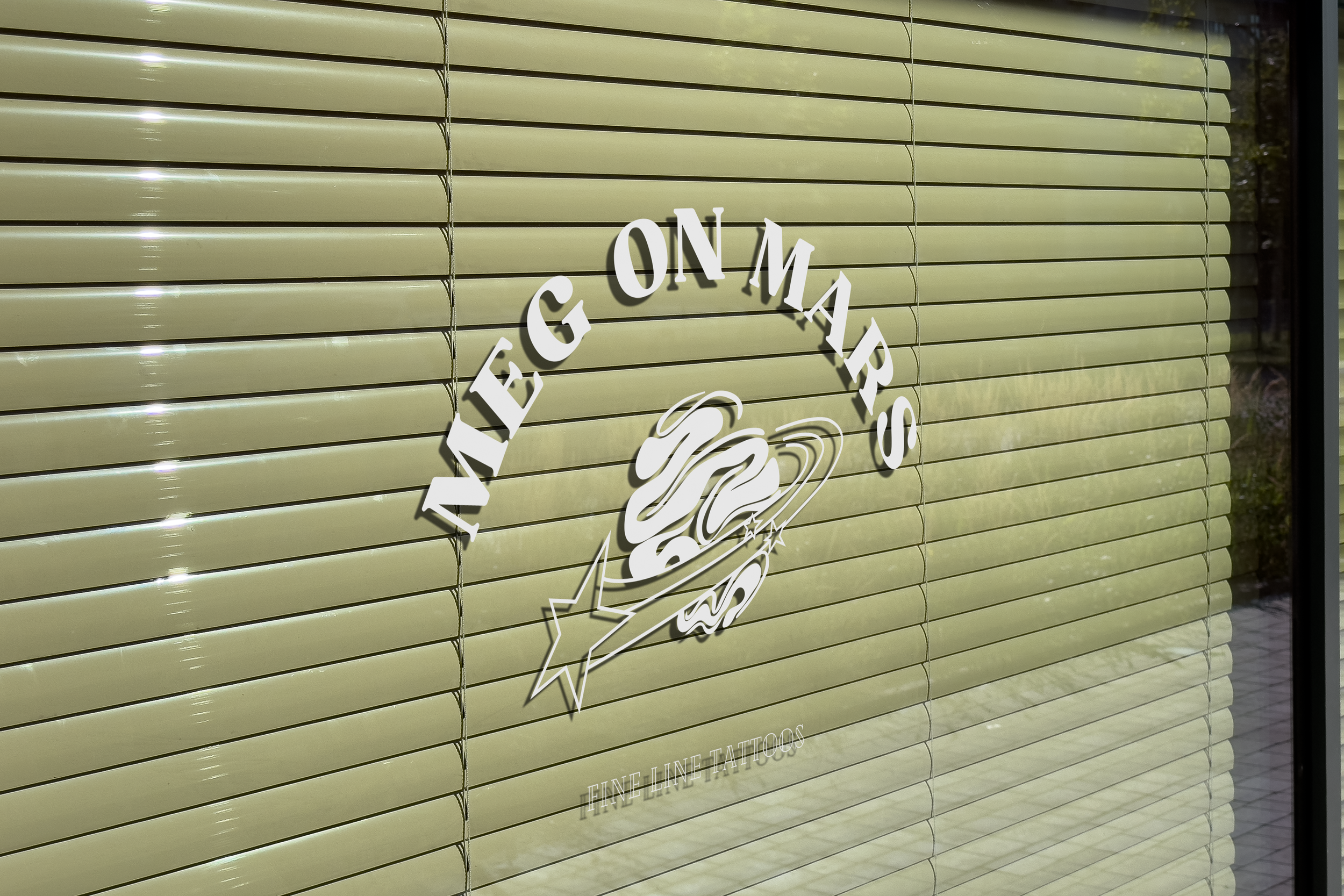
Primary and secondary logos
Brand marks and icons
Colour palette & typography system
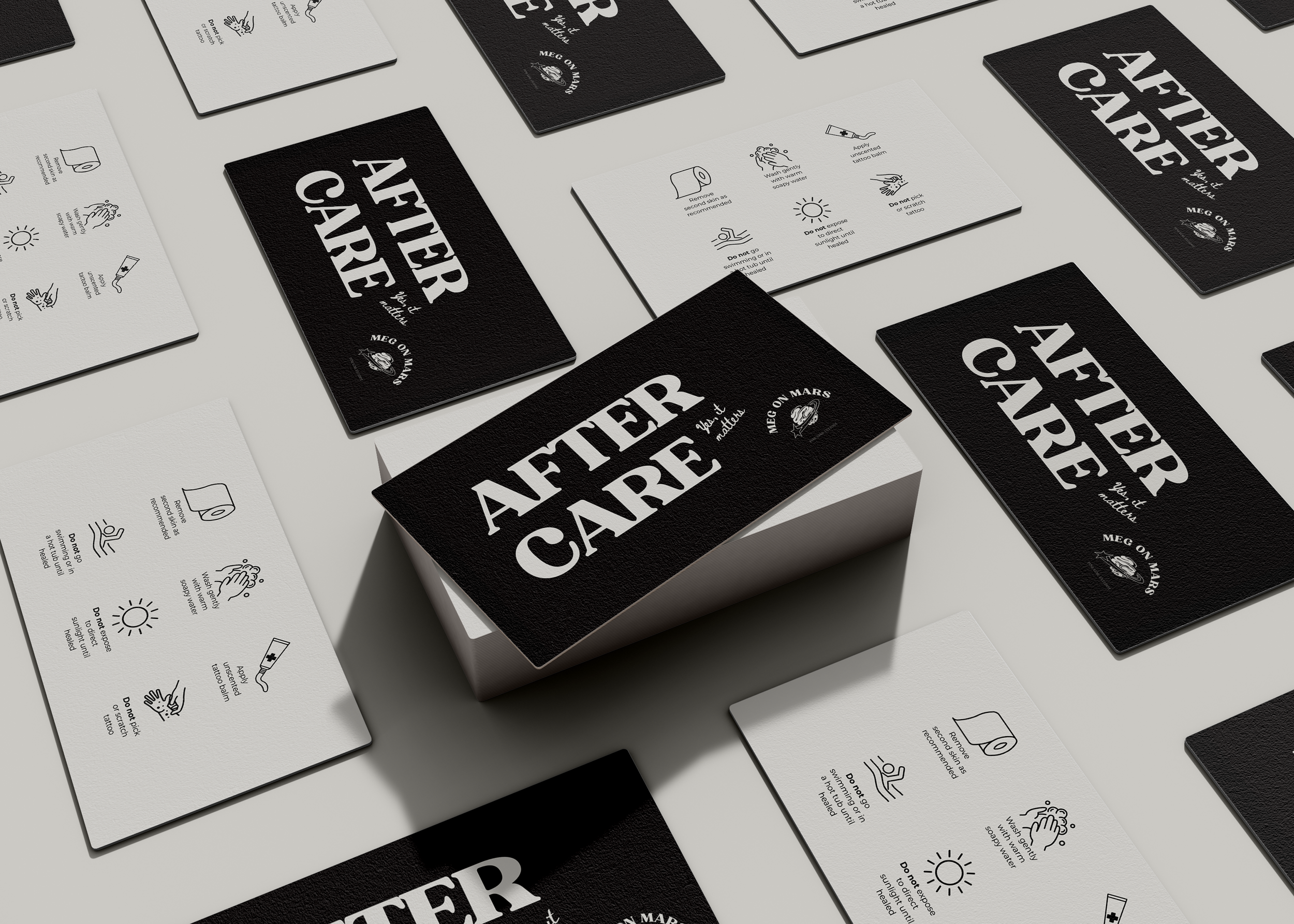
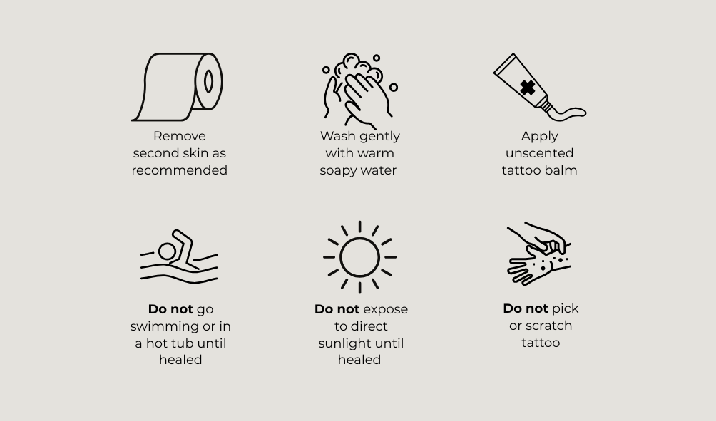
Loyalty cards & appointment/aftercare cards
Flash sheet templates
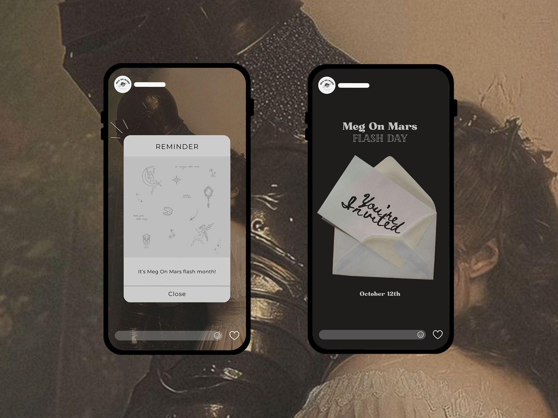
Social media assets (grid & stories)
Merchandise (tote, tee, sticker set)
-
The visual identity for Meg On Mars was designed to reflect the artist’s dark romance, gothic, and ethereal aesthetic. This direction captures the essence of her tattoo style, giving her a recognisable and cohesive identity that stands out from other artists. Bold serif typefaces were selected to subtly evoke the classic tattoo shop aesthetic while complementing the vintage qualities of the brand. A handwritten script adds a romantic, love-letter quality, reinforcing the dark romantic vibe, while a clean sans-serif is used for legibility and contrast, ensuring functional clarity across applications. Together, these elements create a layered and artistic visual language that communicates her unique creative identity.